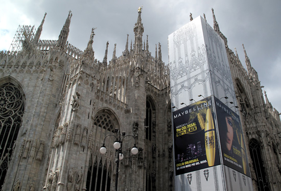
There’s just something about this huge Maybelline ad sky-high against the duomo that doesn’t quite fit.
Things to Read About
- Blog (58)
- Community (15)
- Featured Articles (309)
- Fine Art (3)
- Food! (148)
- Cheese (48)
- Meals (77)
- Shopping & Markets (64)
- Incredible Locations (278)
- Canada (3)
- Haida Gwaii (3)
- Czech Republic (2)
- Prague (2)
- France (22)
- Cote d'Azur (2)
- Menton (1)
- Nice (5)
- Paris (16)
- Ireland (10)
- Ireland (10)
- Italy (195)
- Alberobello (3)
- Aosta (2)
- Assisi (2)
- Bari (1)
- Basilicata (1)
- Bergamo (3)
- Bevagna (1)
- Bologna (7)
- Calabria (5)
- Casale (1)
- Catanzaro (4)
- Cefalù (3)
- Certosa di Pavia (1)
- Cinque Terre (2)
- Città di Castello (1)
- Cogne (1)
- Firenze – Florence (7)
- Follónica (1)
- Franciacorta (1)
- Genova – Genoa (3)
- L'Isola d'Ischia (10)
- Lago Maggiore (1)
- Lecce (4)
- Matera (2)
- Messina (1)
- Milano – Milan (89)
- Monferrato (1)
- Monreale (2)
- Napoli (5)
- Nulvi (1)
- Orvieto (1)
- Ozzano (1)
- Palermo (11)
- Piacenza (1)
- Polignano a Mare (1)
- Puglia – Apulia (11)
- Rimini (1)
- Rovereto (2)
- Sanremo (16)
- Santa Maria di Leuca (1)
- Sicily (20)
- Sirmione (2)
- South Italy Tour (27)
- Taormina (9)
- Torino – Turin (1)
- Trentino-Alto Adige (1)
- Treviso (1)
- Varenna (1)
- Venezia – Venice (9)
- Monaco (4)
- U.S.A. (46)
- Burien (19)
- New York City (2)
- Seattle (34)
- Canada (3)
- Journal (434)
- Design (28)
- Discoveries (155)
- Introspection (139)
- Quips (164)
- Napoli – Naples (4)
- Photos (300)
- Apartment (22)
- Biking (3)
- Canals (48)
- Christmas & New Year's Eve (26)
- Church (21)
- Graffiti & Street Art (23)
- Graphics (35)
- People (102)
- Photo of the Day (107)
- Sardegna – Sardinia (1)


This really beats all. Yikes. We’ve had serious conversations about all this huge digital imagery taking over our public landscape. The production costs have come down 70% in the last ten years so everybody is getting into the act. This drags this majestic landmark down to seeming like just another tourist trap? I’m sure God must be annoyed too. But I understand there is nothing like not being sure you buy the right eyelash mascara?
They’re cleaning successive parts of the duomo and, therefore, drape the parts. I imagine that selling ad space helps to offset SOME portion of costs. But it does seem SO crass!
In all of the supergraphic coverings around town (and elsewhere in Italy) they feature either photographic reproductions or line drawings of the buildings being obscured. It does two things for me: it tells me what the covered part of the building looks like, what I’m “missing”, and it creates a visual continuity rather than a solid, blank shroud. Some are quite innovative and create a fun visual play. (These supergraphic covers have been one, of many, photographic subjects that continue to get my attention.)