Last year here in Italy, I traveled with an international group through the Legacy of Letters tour. Part of the program was the group collaboration on a large printed piece that was both poster and booklet. Our creation was rendered under the mastery and guidance of artist/letterpress printer, Lucio Passerini, while at the Tipoteca Italiana Fondazione. At the end of the tour, when farewells were being said, Lucio invited me to collaborate with him on a printed project the next time I was in Milano… which is now.
Two days ago I wrote to him with that phrase and a loose list of words swirling in my head… and no solid concept of the form it would all take. Lucio wrote back and said it would be a “typographic jam session” on-press. I liked that. We’d “wing it” and see where the words took us.
Our collaboration started at 3:00 yesterday with the consideration of the words… weighing, comparing their meanings, similarities and differences. We honed, each adding to and deleting from the list. Then we started brainstorming about design, form and fonts, many times finding that our ideas were mirrored by the other. Those were fun moments.
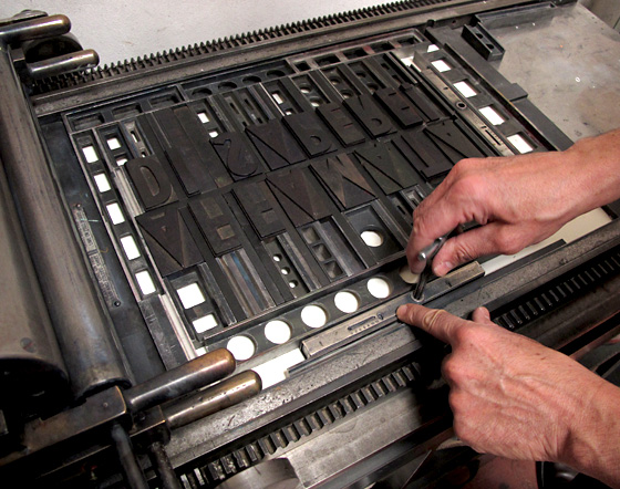
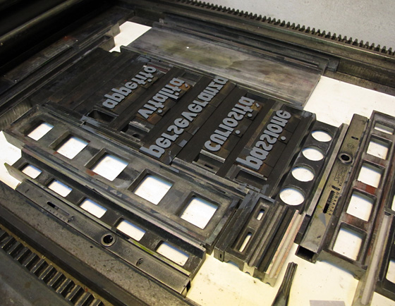
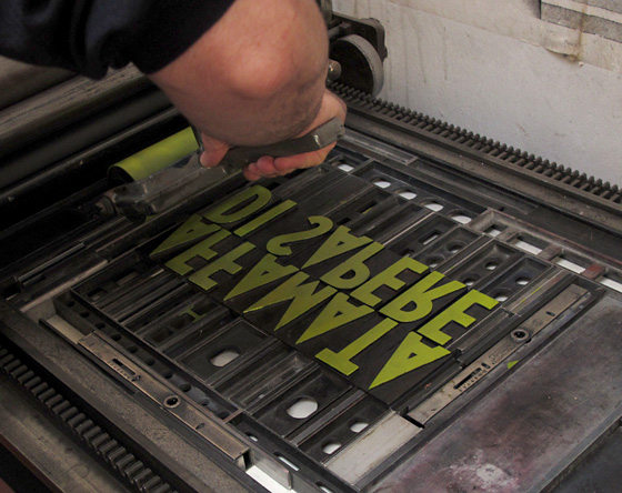
Letterpress printing boils down to each individual letter being put into place one-at-a-time. We were working with woodtype from the early 1900s, from Lucio’s collection. We composed the words, fussed with the spacing, then surrounded everything by a hundred various, mathematically-calculated pieces of metal until the whole thing created an entire rectangle. It was all then clamped rigid onto the press base, ready to be inked and printed. Lucio’s been doing this for so many years and I enjoyed watching his process, seeing his thoughts made visible as he worked.
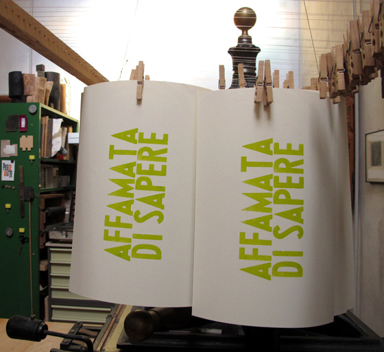
We printed for 5 hours, adjusting layout and color on-the-fly. “A touch of red” in the green. “A little taste” of white and blue in the dark gray, aiming for more sophisticated color admixtures. The spring green came off the press first, hung to begin drying, then we printed the word list in its dark gray.
Look at all of the individual pieces to create those three words. And many are so small you can’t see them here.
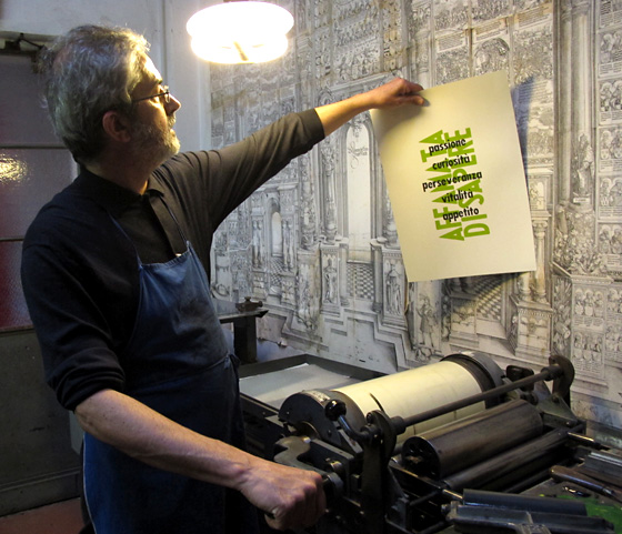
I hung up the printed proofs then we stood across the room to judge the letterspacing and then make adjustments by adding and removing pieces of wood and metal between each letter. (Our green ink started out much too “lime” for my taste so we made it more of my favorite spring, wasabi green.)
Forty printed sheets were hung from a rack suspended from the ceiling, waiting for the second impression.
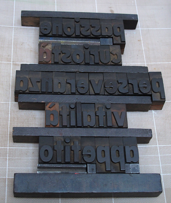
Sometimes typos hide when reading things backwards. Do you see the error in the following photo?
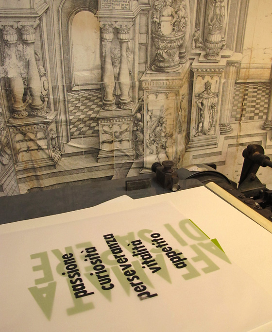
We printed a tissue paper proof to determine the best position of the word list, overlaying the “affamata” phrase.
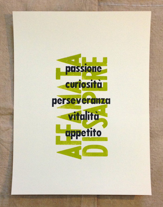
We both smiled when the first, final piece came off the press.
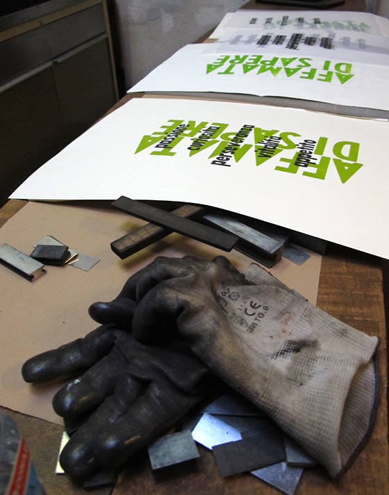
“Hungry to Know. Passion, curiosity, perseverance, vitality, appetite.”
When we finished, we joined Lucio’s dear wife at their home, for a celebratory toast, appetizers and a chat. It was a very good day. Grazie, Lucio!
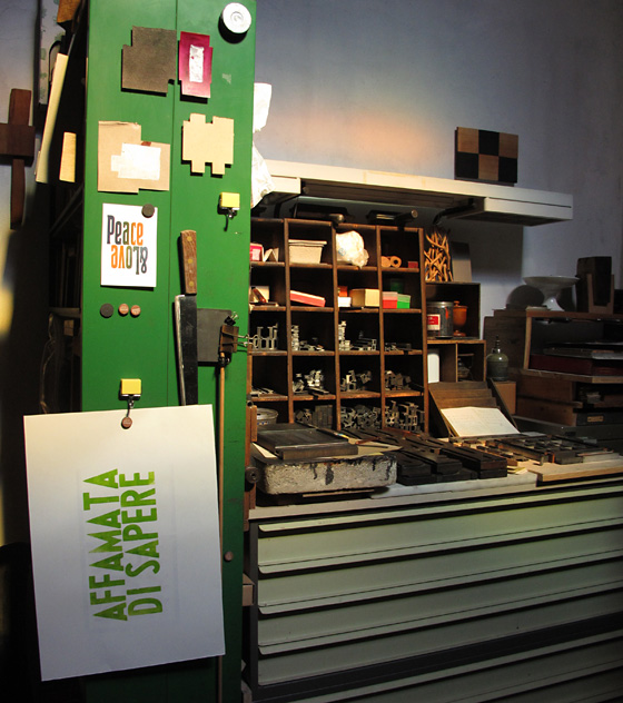
Here are shots of part of Lucio’s studio/print shop. Note how the light changed between 3:00 and 8:00 p.m. (Click on each one to enlarge the photo.)

